Newsletter

Join our mailing list for latest news and features

Build Hollywood

Build Hollywood

Build Hollywood

Build Hollywood

Partnerships

Joseph Melhuish’s characters come to life in the beating heart of London town

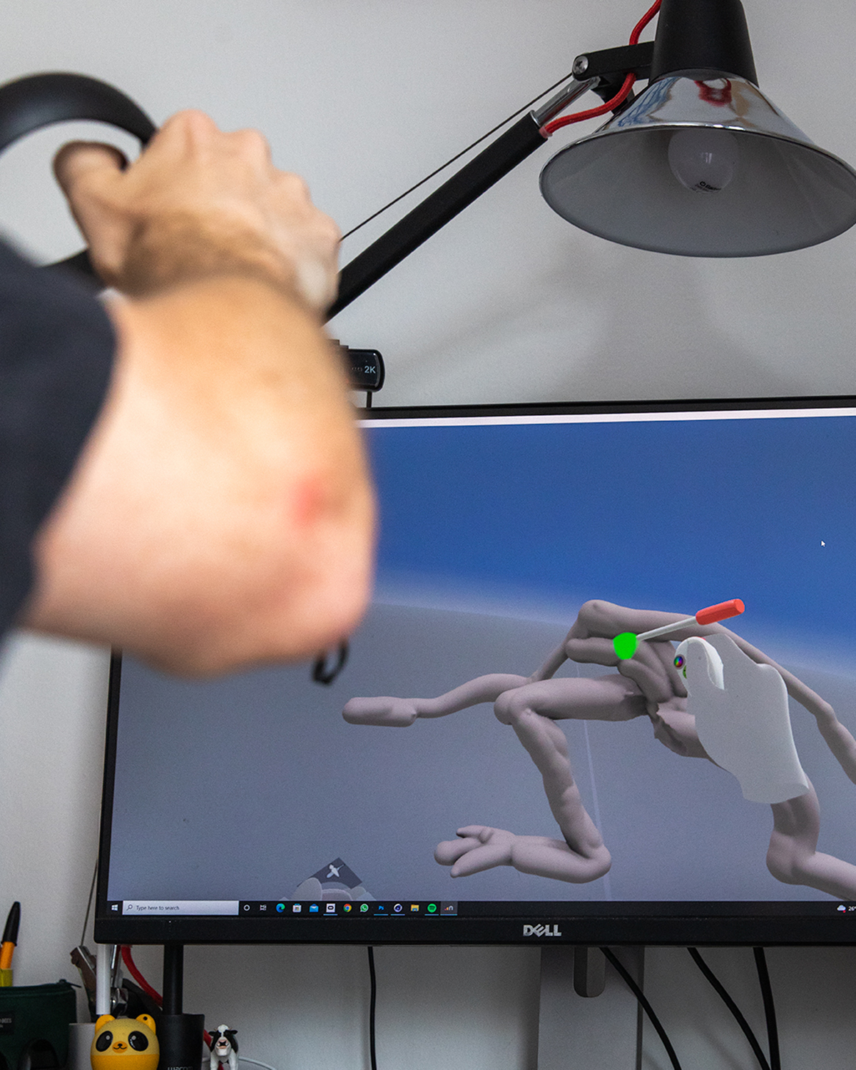
Channeling humour and sincerity in the same breath, Joseph Melhuish’s digital work has leapt into the physical with BUILDHOLLYWOOD’s Creative Studio and Creative Reviews’ mega collaborative installation, transforming his URL figments of imagination into IRL characters with heart. As roadside installations go, it’s a master stroke. Speaking to his early influences, the hands-on collaborative process with the Creative Studio, and the “neuroses” that accompany authentic artistic expression, Joseph shares a candid insight into what goes into his builds, from sight, to screen, to street-side.

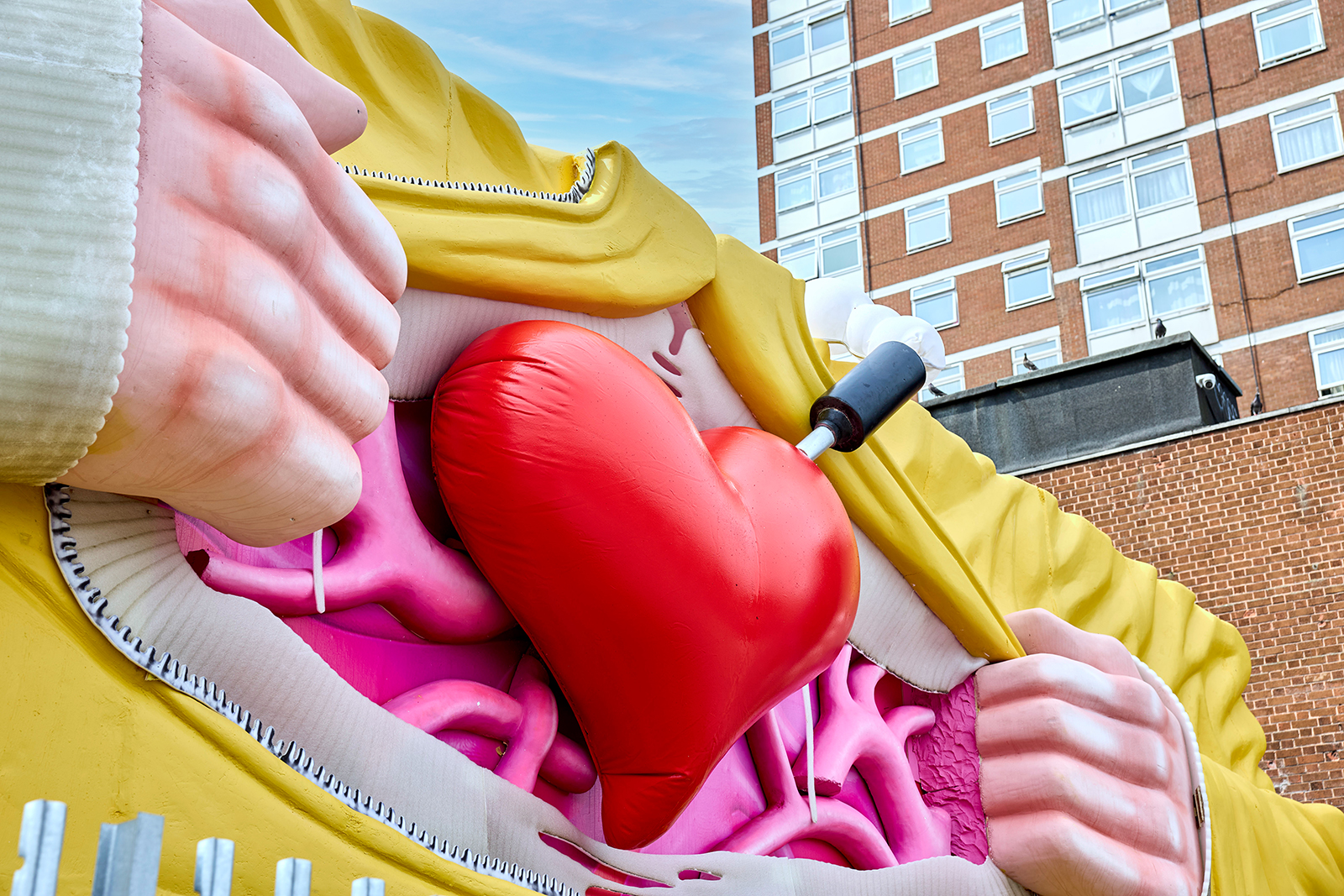
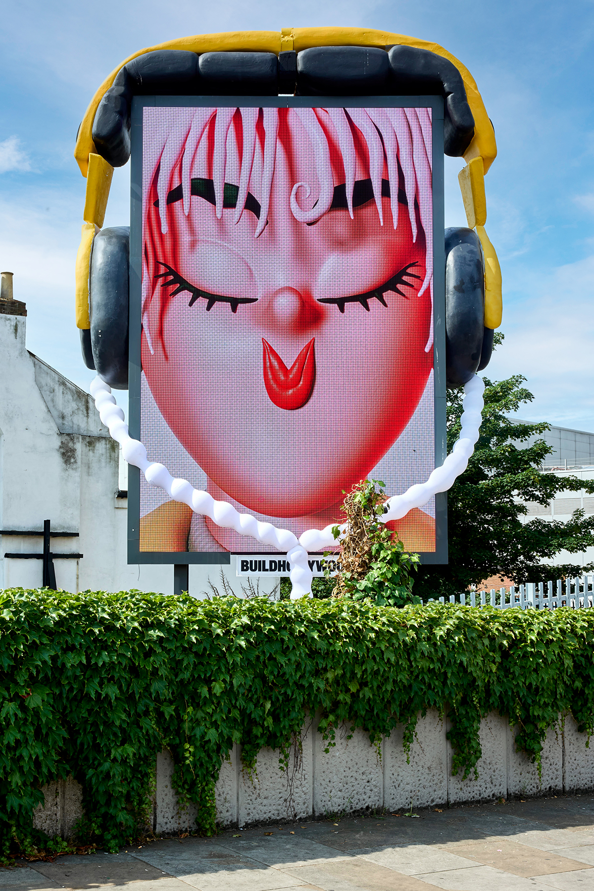
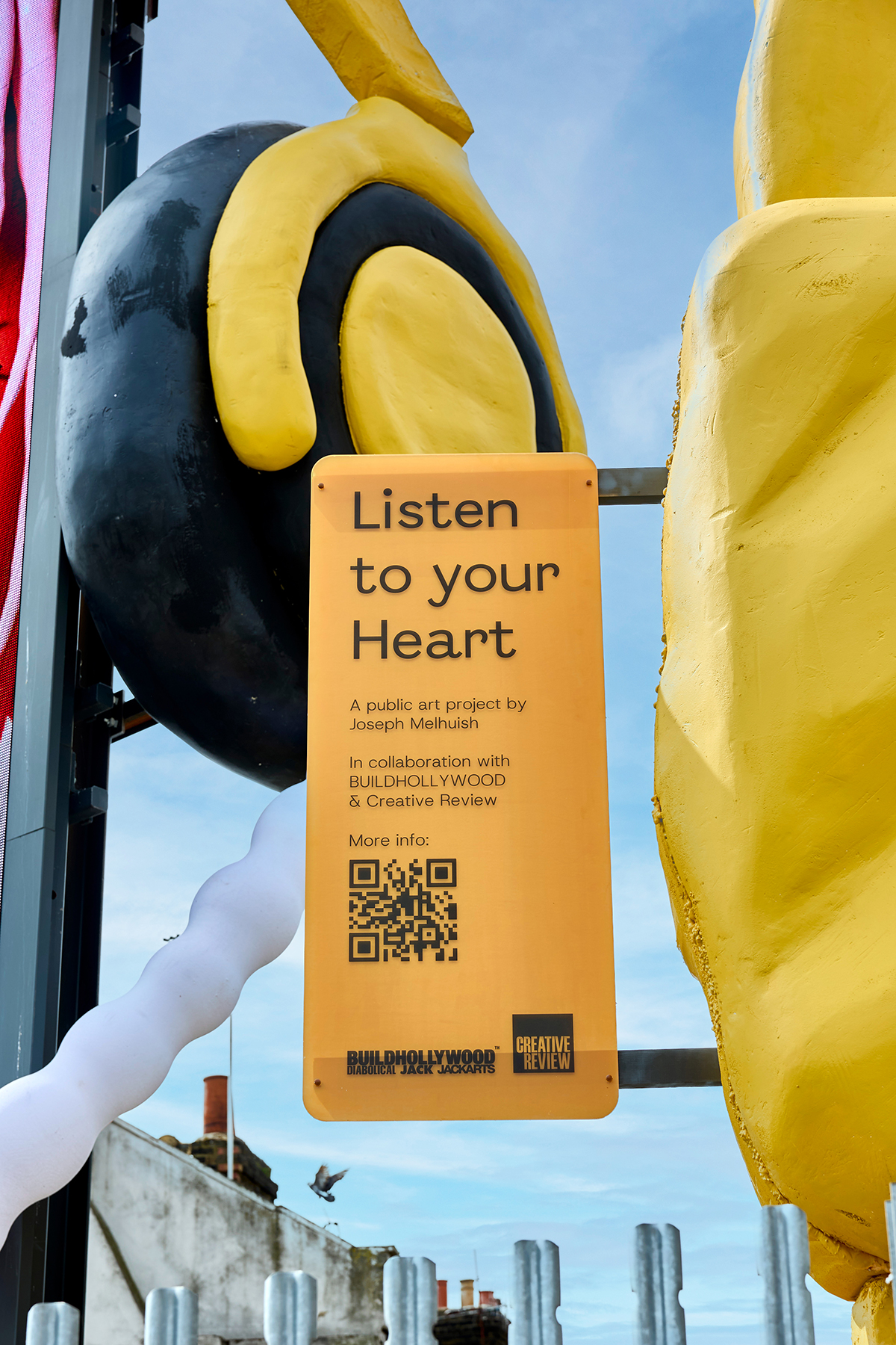
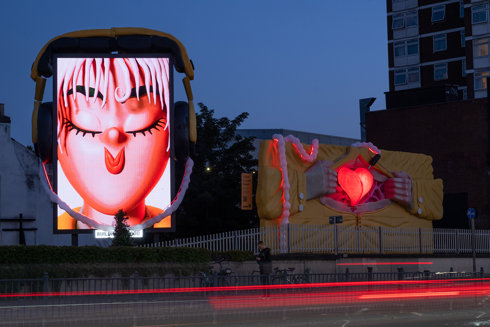
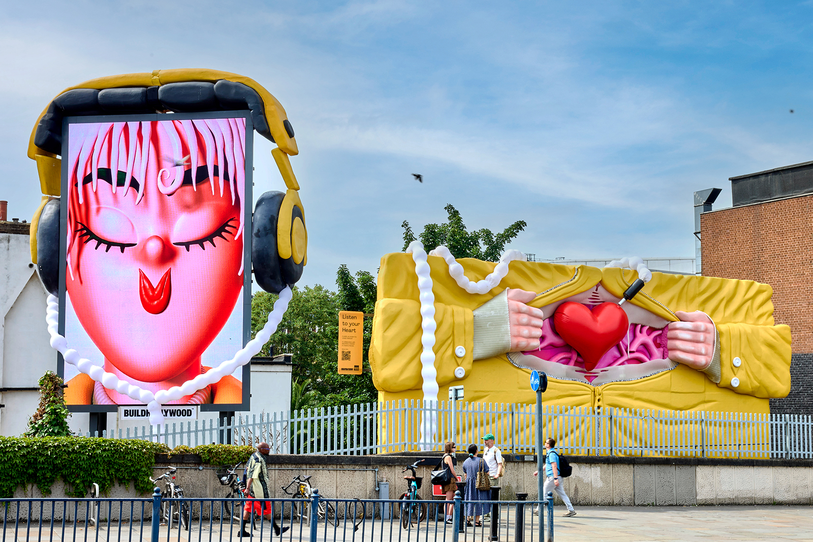
From the highway to Coachella stateside, to the BBC screen on British soil, Joseph Melhuish’s work is far reaching, now finding itself in London with a physical tilt to his typically digital practice. Working in collaboration with Creative Review and BUILDHOLLYWOOD’s Creative Studio, Joseph has dreamt up a striking two-part, three-dimensional billboard that experiments with form and subverts structure, delivering Listen To Your Heart, a piece of public art that invites curiosity and tests the limits of optimism.

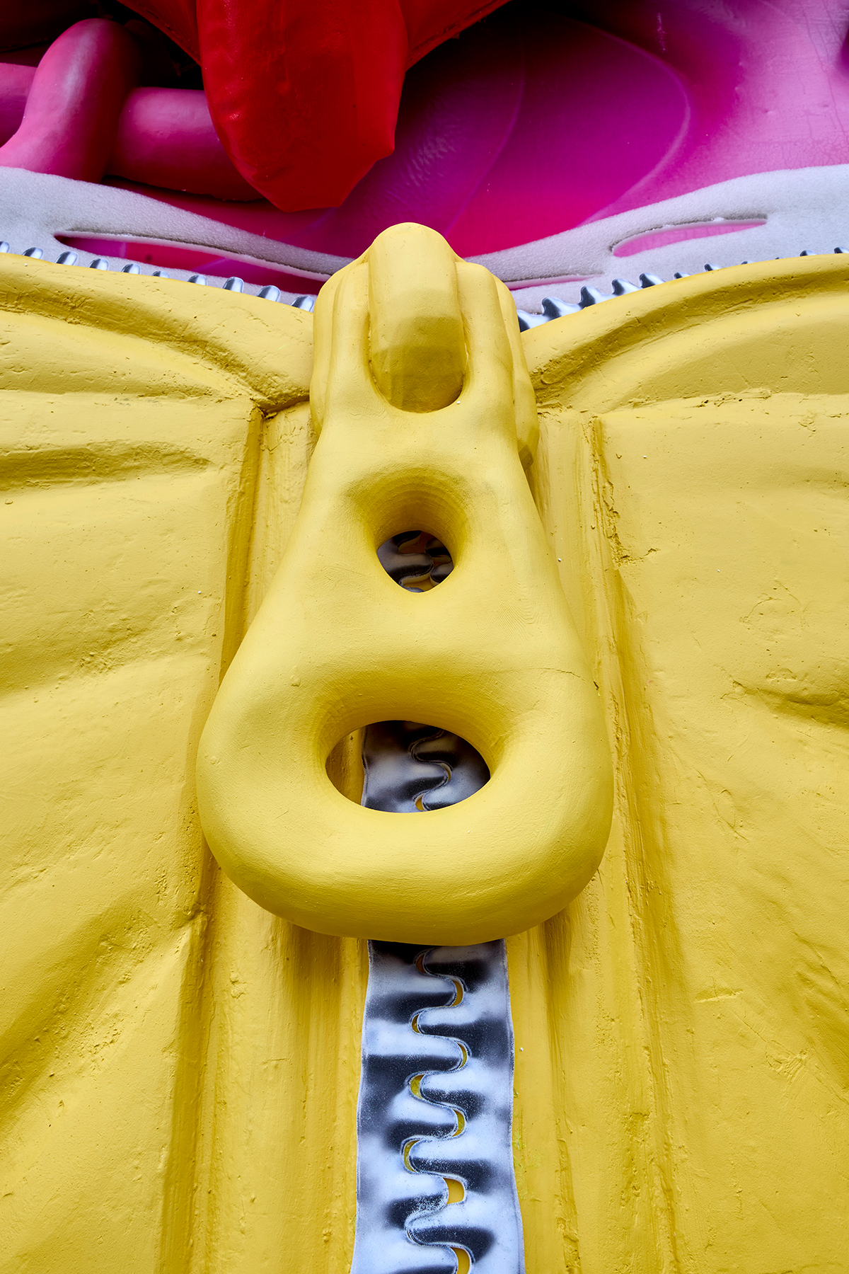
Installed across two billboards, the upright digital screen features a blissed-out visage. Eyes shut, pursed smiley lips and fleshy tendril bangs, looking ever so serene in her oversize cans. On the adjacent billboard, a pair of hands rips apart a forty-foot-wide hoodie top to reveal pinkie-purple cardiovascular gore and a cute cartoon heart with a jack plugged into it. Somewhat freakily the headphone cable meandering between these two very special builds resembles an umbilical cord. Head and heart conjoined like a mother and child, expressing how lifesaving it is to listen to the beating music of our hearts.

Start to finish, BUILDHOLLYWOOD’s Creative Studio worked closely with Creative Review and Joseph to realise this ambitious, groundbreaking work – from idea generation and concept development through to production and installation. BUILDHOLLYWOOD’s Creative Studio’s operation is home to a dynamic team of artists, designers, set builders, prop makers, and carpenters based in a 4000 ft purpose built studio nestled in a leafy pocket of North West London.

23.06.25

Words by Elsa Monteith

“The plan is that we’re going to make every part of it with a relevant material”, Joseph says, from a rubbery “not-quite-rubber” material to muster up the heart of the project, to translating the nuance that can be created in a physical build as opposed to the kind of “messy, chunky look” that disposes of finer detail often found in the digital realm. “A lot of what they’re building is going to be handmade”, he says, with the street-side build adding a humanoid touch to what could be initially read as a solely digital façade. It’s clear that Joseph’s work extends far beyond the screen, with a profound sense of character situated in his work that provokes conversation amidst his admirers. “Do you mind people having their own interpretations?” we ask – “I think it’s great” Joseph responds, “it’s the whole fun of it, even if they hate it. It gets you out of your safe space of making art for people who are just like you”.

“Humorous, grotesque and glossy” are the three words Joe chooses to describe the work of renowned American artist Jeff Koons, a collection of adjectives that also fit quite neatly into Joseph’s own assembly of work. “I would say he is strangely one of the people that most affected how I started changing my work when I was finding my style”, shares Joseph, detailing a specific kind of “sickly humour” that pervades much of Koons’ catalogue, as well as his own extensive collection. The involvement of this sticky, messy lexicon feels just right for Joseph. His work is meticulous and well articulated; bright, bold and clear as day, whilst still retaining an air of absurdity, a premise that, for him, exists in the same vast world of horror and comedy.

This world is one we feel in constant orbit, a hazy globe of absurdist optimism found at the heart of Joseph’s work, and a steady step toward a new era of experimental billboard builds with BUILDHOLLYWOOD’s very own Creative Studio.

You can catch the larger-than-life public art piece at 13 Shepherd’s Bush Green, London, W12 8LE, and for the full heart-stopping experience, don’t miss the special show times during from 9-11am and 4-6pm when the installation truly comes alive.

Your work is renowned for its vibrant, surreal characters often crafted through virtual reality. How did you approach translating this digital aesthetic into a large-scale physical billboard with Creative Review and BUILDHOLLYWOOD’s Creative Studio?

It has been different, I haven’t really had to think about the physical construction of something before. I tried not to get too spooked by it, and just treat it like anything else as much as I possibly could, especially since the team came to me saying they wanted challenges and ambitions. It’s tempting to try to solve the problems as you’re making it, or get ahead of how this could be built, but I tried to think about what it would be if it was a flat illustration, and then we can solve the problems as they appear, in terms of making it real.

Many of your characters seem to exist in a kind of abstract, otherworldly space. Do you draw inspiration from any specific artists, genres, or even childhood influences that shaped your visual language?

I don’t always like to pinpoint exact things, but I think strangely, undoubtedly, I’ve been influenced a lot by Quentin Blake the illustrator. His illustrations are quite whimsical and wholesome, but I feel like his characters being sort of discombobulated and stretched has come into the way I am interested in drawing people and bodies. I’d say I’m influenced a lot by photography perhaps more than other illustrators, just any artists that are into people and studies of people are the ones that resonate with most, or anything that’s got a bit of a sickly humour. I would say Jeff Koons is strangely one of the people that most affected how I started changing my work when I was finding my style – his work to me is quite humorous and grotesque and glossy.

Can you talk a bit about the thematic ideas behind your billboard and your work more broadly? What were you hoping to express visually and emotionally through this piece?

It’s public art at the end of the day, and I didn’t want to create something too cynical. I wanted something that has a message of optimism or hopefulness, that was the feeling I was looking for in my own ideas. The site has two billboards – this vertical one and a horizontal one next to it, so I thought that there should definitely be some kind of storytelling link between the two. Every idea I had had to have some kind of connection to the other, either visually or physically. So all the ideas I was creating were like that, and some of them were just simple visual puns. I think I presented four or five ideas in the end, and this was the most optimistic message which is about listening to your heart. It felt contemporary and playful, but also slightly grotesque, because she’s kind of ripping open her own chest. It’s an arresting visual.

From the first sketch to final install, the Studio’s process is incredibly hands-on. Can you walk us through the journey of developing this piece from concept to creation, and how your idea evolved through that process?

I think I spent a full week and a half coming up with ideas. My routine for coming up with ideas is spending a lot of time researching and thinking about what would be a good idea. I was going to galleries and trying to fill my time with thinking about other people’s art and just experiencing stuff. Going to a gallery is a fun way to get inspired by other ideas, even if they’re not related to what I’m seeing – it gets you in the headspace of interrogating images and thinking about stuff. I’d sit in a cafe and draw on my iPad, and then I’d go back to the studio and look at them the next day, put them in Photoshop and see which ones were working, and do something similar the next day. And then after three days of doing that, I pick four or five to actually finalise. The first drawing I had of the heart was a very realistic heart, the whole thing was quite gory, it had a ribcage and stuff, and I wanted to make it a bit more accessible, so that led to refining and designing the character a bit more and thinking about who they are and what the clothes mean. All this sort of stuff takes time.

Your art often embodies a sense of self-described “awkwardness and charm” informed by humour and absurdity. Is that a conscious choice, or just an organic part of how you see the world creatively? How did this signature style manifest in the physical billboard?

Maybe awkward isn’t the word, but I can be kind of neurotic (laughs). I think a lot of people who make work put a few of their own vulnerabilities in it in order to express themselves. It’s fun to put something of yourself into what you’re making. So for sure, a lot of what’s in it is just me, but to caveat, I kind of like the aesthetics of self-serious fashion and music, but I find it fun to subvert it by making things that are supposedly cool sort of goofy and funny. I think absurdity for me, as well as horror and comedy, are all in the same world. I’ll sometimes try to have something unsettling about an image, or something ecstatic about it, it’s so over the top that it’s verging on discomfort.

Your portfolio includes work for clients like Apple, The New York Times, MTV, and Nike, and I was particularly drawn to your animated piece for Travel Portland which was a surreal, genre-bending take on tourism. What has been your favourite commercial project to date?

I like anything where it gets out in the wild and people see it outside of Instagram or the internet. It’s fun doing a record cover, but when it’s just on Spotify and Bandcamp, it feels limited in its reach. I did a billboard for RCA records at Coachella last year which was a really fun one. Two things I like in a project is when it’s really short, and when it comes out straight away so I don’t have to wait around. For this, I got the brief on the Monday, I sent the file to them by Thursday, and then it was up on Monday the next week, on the highway going to Coachella. People were taking photos of it and there were Reddit threads about it, and people had their own weird readings of what it meant. Doja Cat was on it as a cat, and the RCA logo was this dog, and all the other artists on it were dogs. People were sort of inventing their own meanings about the dog and the cats (laughs). Loads of people thought Doja Cat had made it herself, because, I didn’t know this, but apparently she paints and makes art and it’s not dissimilar from my style.

How has living and working in London influenced your creativity? Are there particular aspects of the city’s culture or community that have shaped your work? What are your favourite London haunts?

I grew up in a small village sort of near Bath and Swindon, so I had no real access to the bigger movements in culture that were happening in London, so for me moving here was imperative in understanding trends and what was going on in the world of design. I almost don’t know what I would have made if I hadn’t gone there – the work I was making before, and I know I was young, but it was a million miles away from what I do now. Even getting into 3D stuff was just through my friends that I had at university. A lot of my work is about clubbing and music culture, and I wouldn’t have access to any of that without being in London.

In terms of my haunts, there’s this trifecta of venues in south London; Venue M.O.T, Ormside Projects, and Avalon Cafe. I go to those venues all the time and they have amazing curation.

This collaboration with Creative Review and BUILDHOLLYWOOD brings your work out into the public in a major way. How does it feel to see your characters and imagination take over a billboard in the city?

It’s super exciting. The location is crazy, it’s right outside Westfield so there’s going to be tons of people seeing it. It’s kind of a pressure, but I’m also trying not to think about it. I think I might start panicking once the build is like halfway done (laughs). I’m used to people seeing my work, I guess here people might start talking about it. I don’t feel like it’s too controversial and I’m not too worried about people being upset. I never care if people like it or don’t like it, obviously it feels good if they do. It’s exciting, it always is.

Beck: Colors - Mural - DIABOLICAL

Previous article

Beck: Colors

Next article

Partnerships

The People Behind Queer Emporium