Partnerships
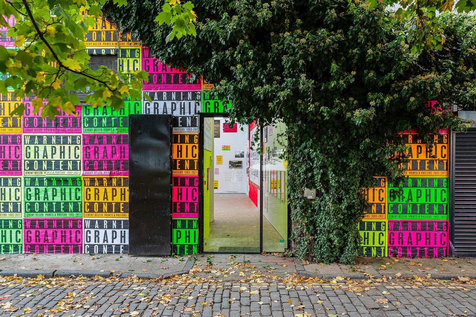
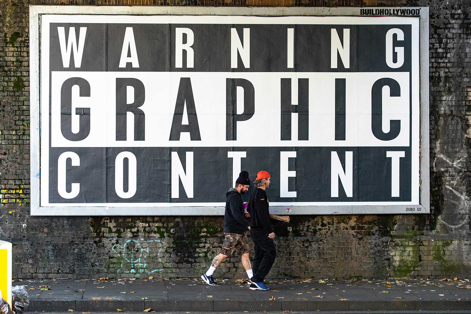
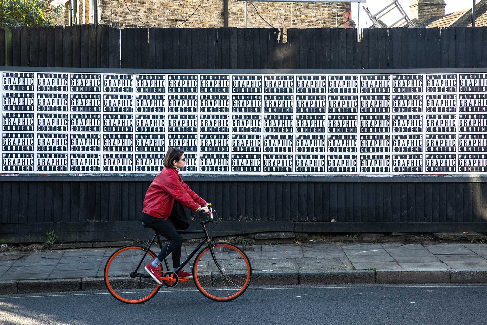
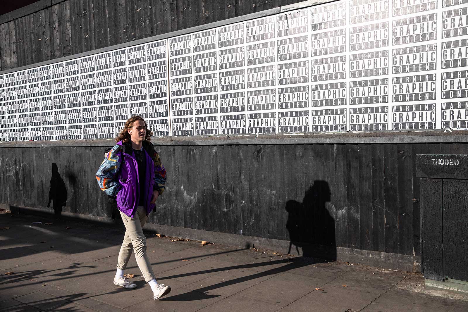
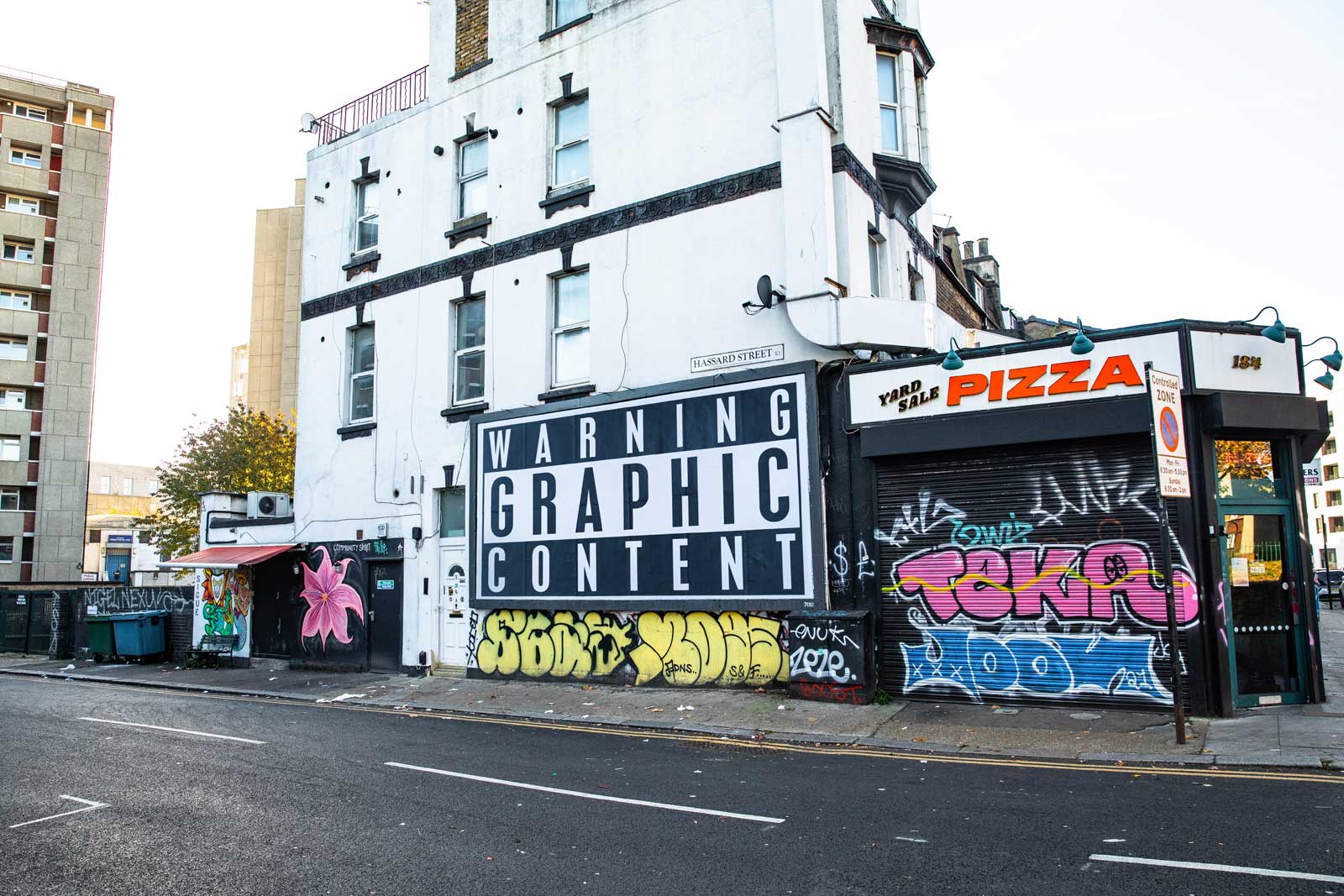
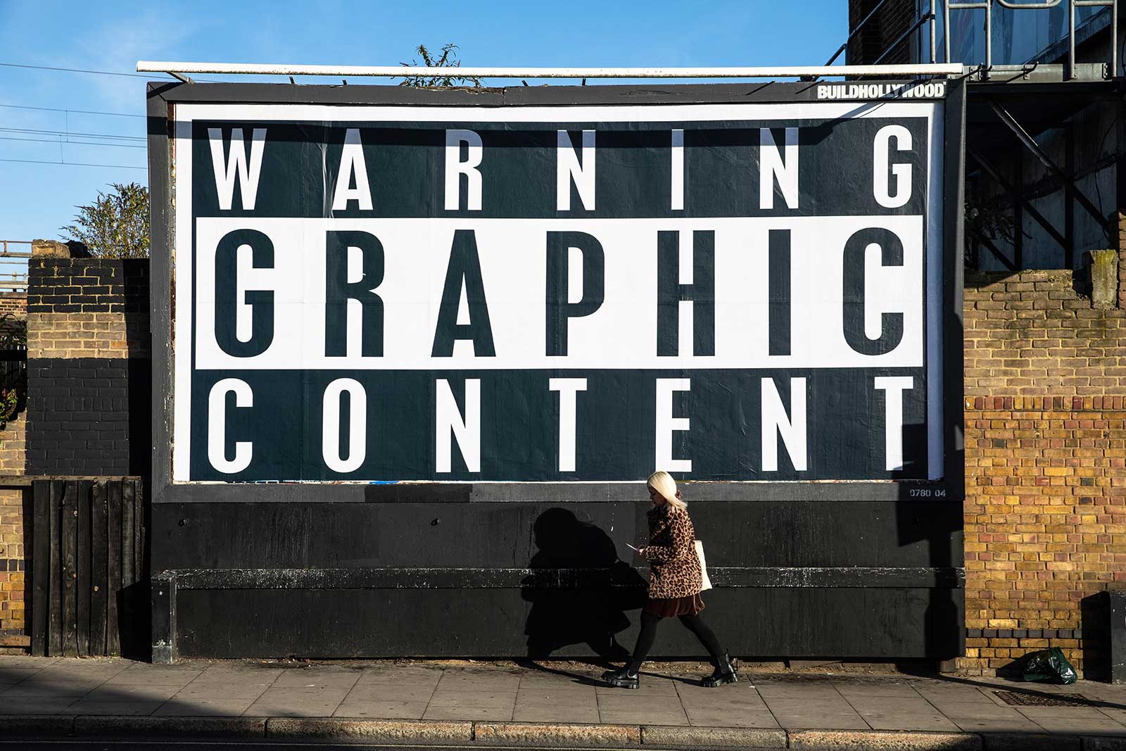
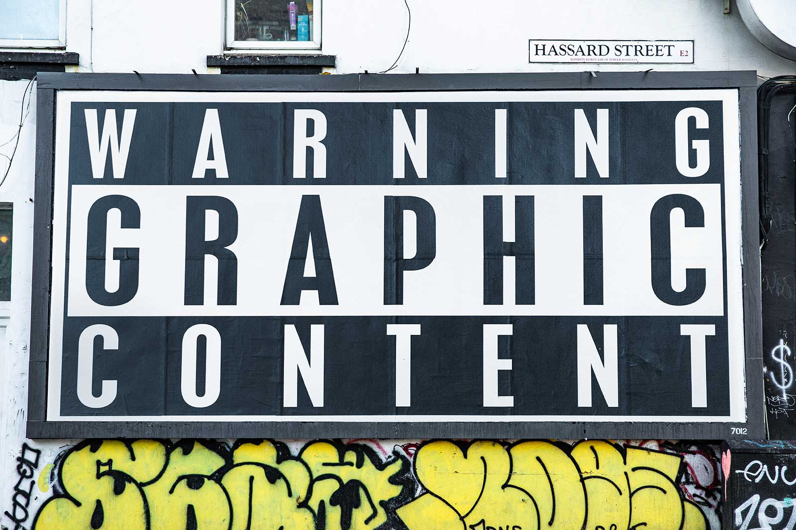
WARNING GRAPHIC CONTENT
The Modern Institute, 3 Aird’s Lane, Glasgow G1 5HU
05/11/2021—22/01/2022
BUILDHOLLYWOOD are excited to be supporting one of Britain’s most celebrated contemporary artists. In a typically low-key appraisal of his new show being exhibited simultaneously in Paris and Glasgow the artist has said, “It’s good to see what’s been under my bed all these years.”
The exterior walls of The Modern Institute’s Aird’s Lane Gallery in Glasgow are currently blitzed with posters that point to censorship. The original black and white Parental Advisory label was introduced in the US in 1984 after pressure from, amongst others, Mary “Tipper” Gore. She co-founded the ‘Parents Music Resource Centre’ whose stated aim was to increase parental control over the access of children to music deemed to have violent, drug related or sexual themes via labelling albums, CDs and cassettes with ‘PARENTAL ADVISORY EXPLICIT CONTENT’ stickers.
In 1985 the American musical virtuoso and arch non-conformist Frank Zappa – even before the Recording Industry Association of America officially adopted the sticker – printed a satirical advisory message on his ‘Frank Zappa Meets the Mothers of Prevention’ album covers to protest at the PMRC’s political activities. The message read: “This album contains material which a truly free society would neither fear nor suppress.”
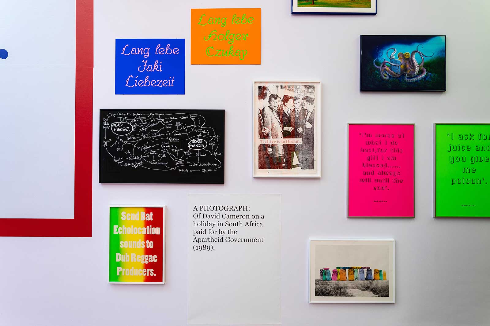
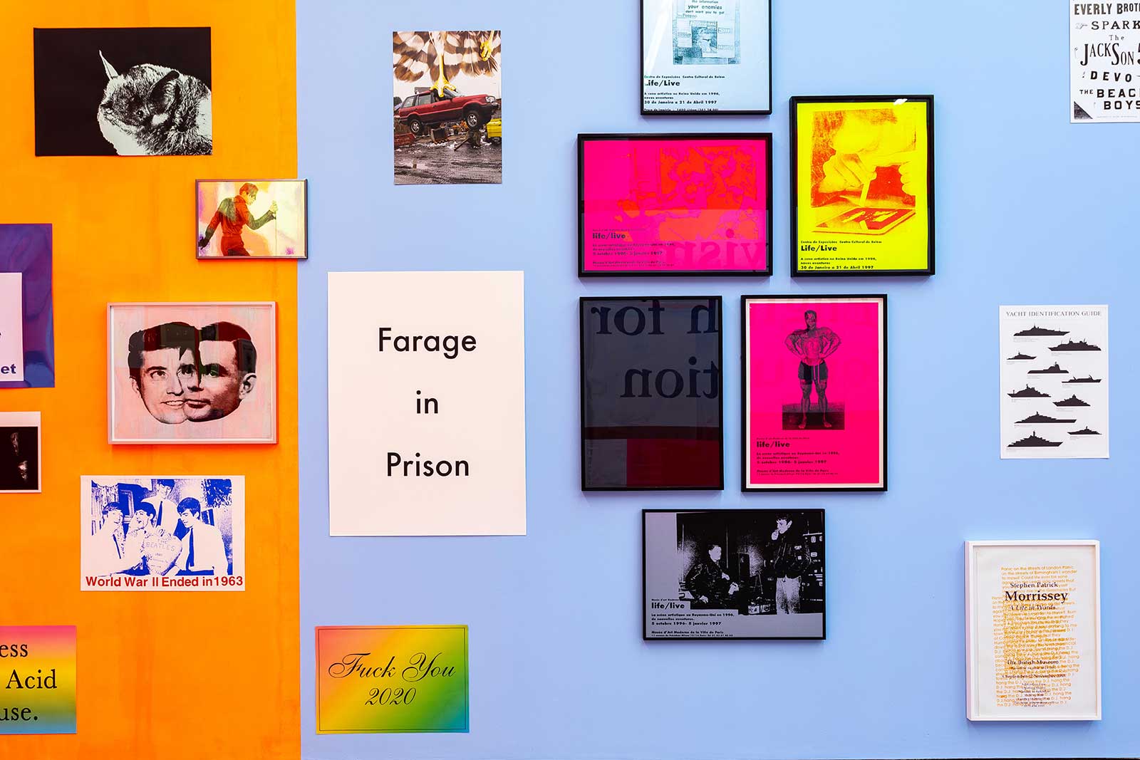
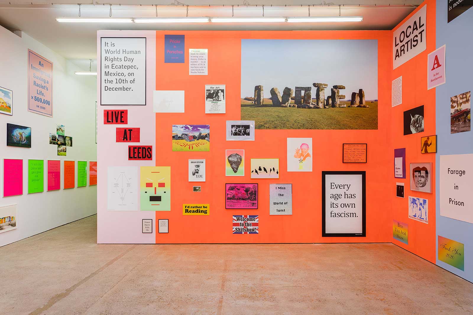
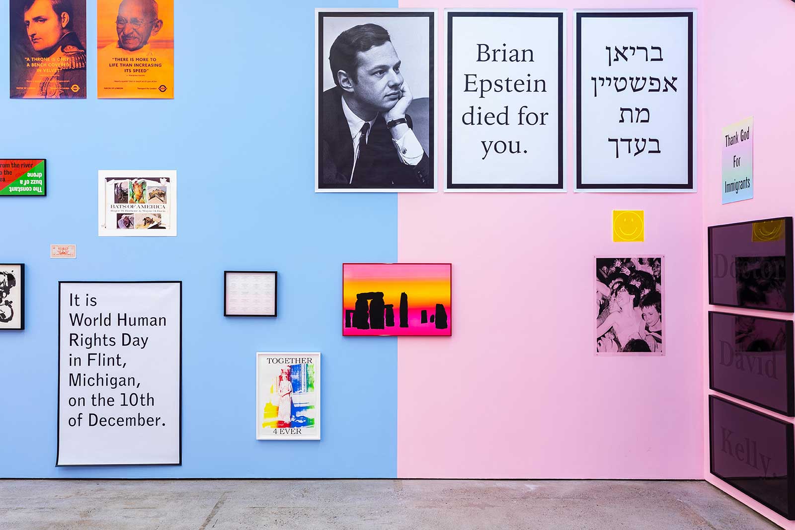
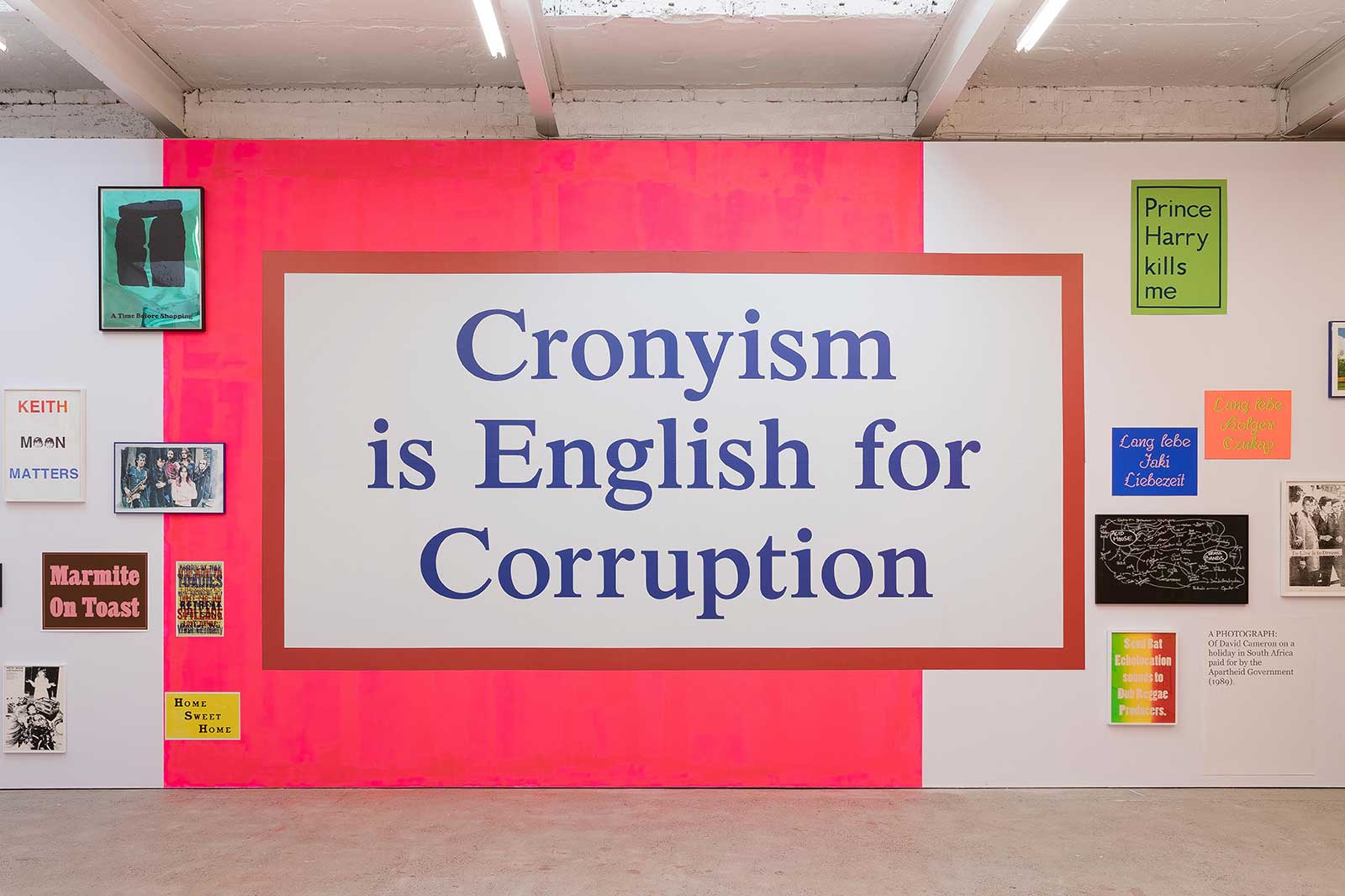
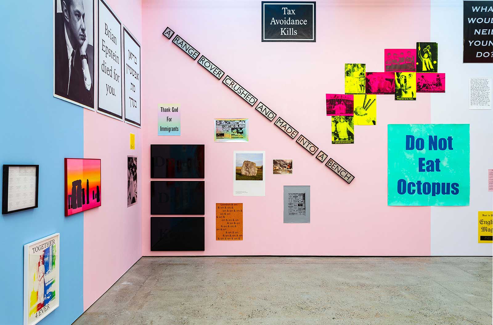
You get the distinct impression that Jeremy Deller is more ‘Team Frank’ than ‘Team Tipper’. Plastered alongside the black and white iterations of his Aird’s Lane ‘WARNING GRAPHIC CONTENT’ posters are pink, green and orange fluoro versions of the same message. The original warning labels, of course, achieved the opposite of what they set out to do. Acting like magnets for curious minds, the stickers were a sign of challenging, transgressive works you should be paying attention to. So it is with Deller’s multi-coloured street installation/invitation to view his near 30 year survey of ‘Prints & Posters 1993 – 2021’. This show is an understated tour de force.
23.11.21
Words by