Newsletter

Join our mailing list for latest news and features

  • Interests:
Menu

Build Hollywood

Build Hollywood

Build Hollywood

Build Hollywood

Partnerships

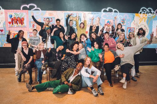
Sheffield Hallam BA (Hons) Illustration students share vibrant, heartfelt work across the city

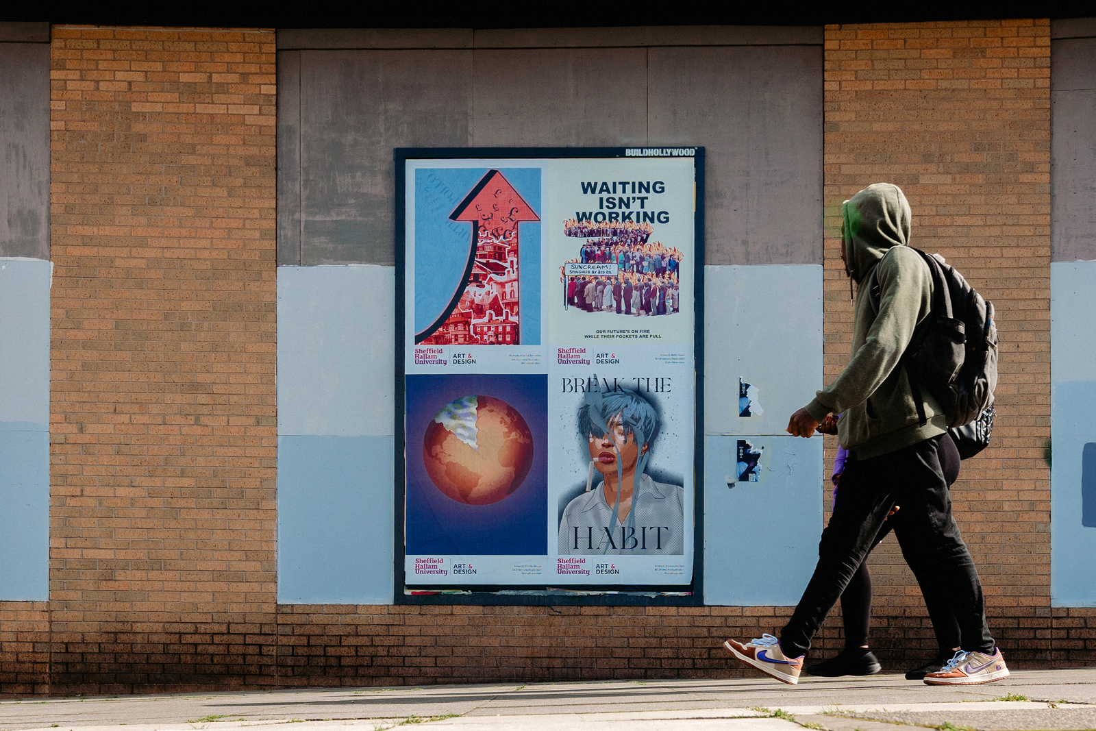
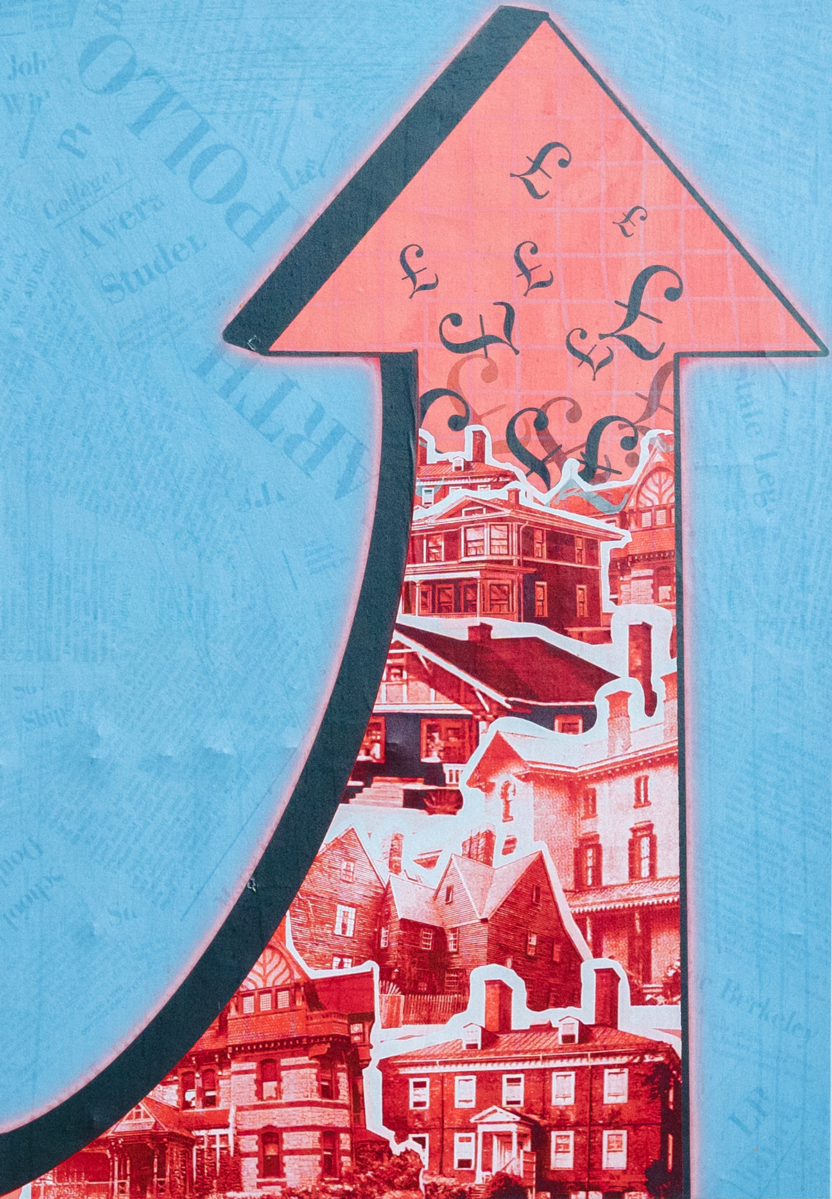
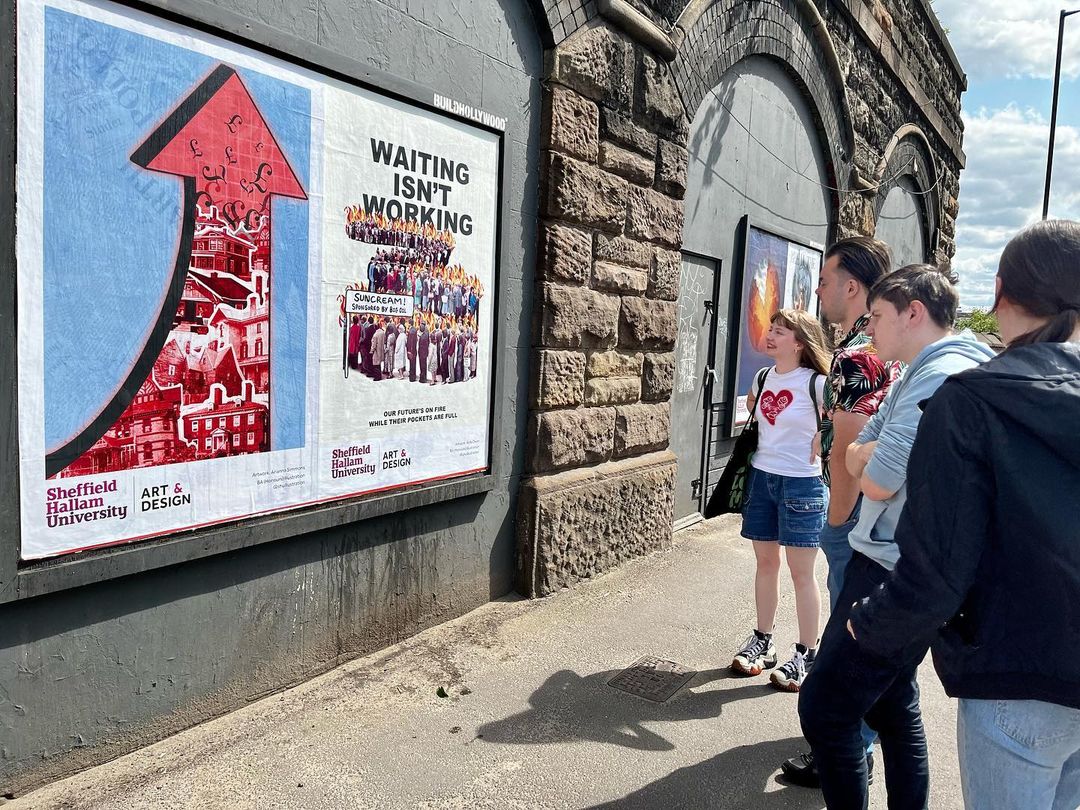
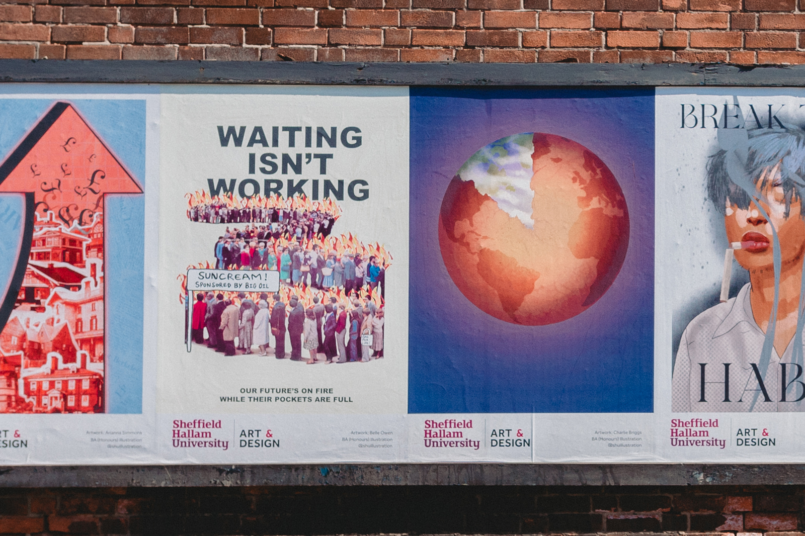
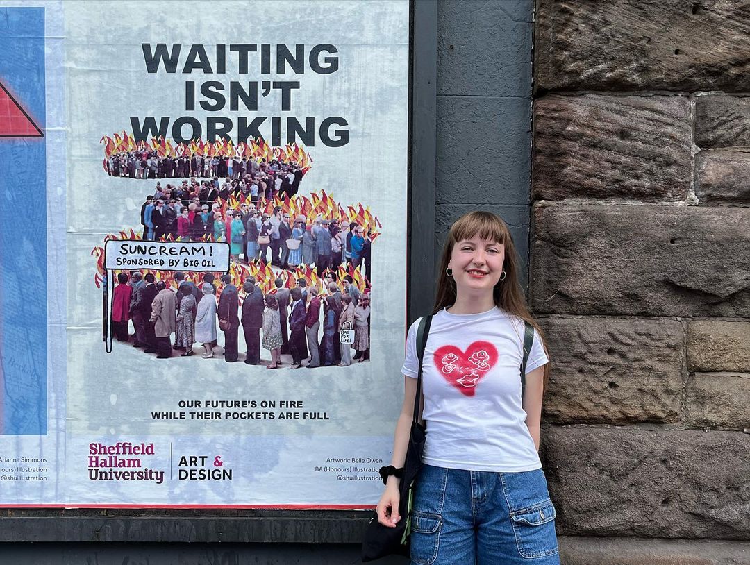
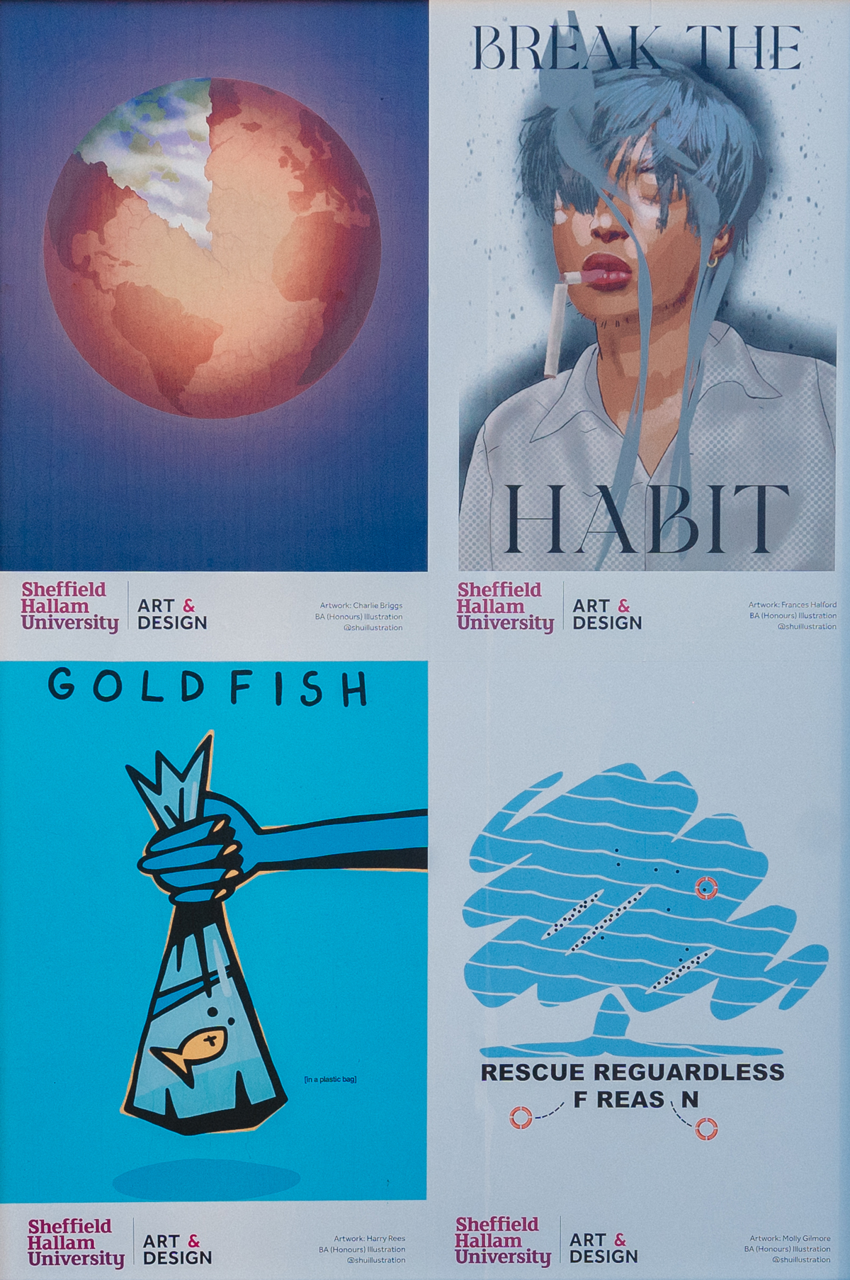
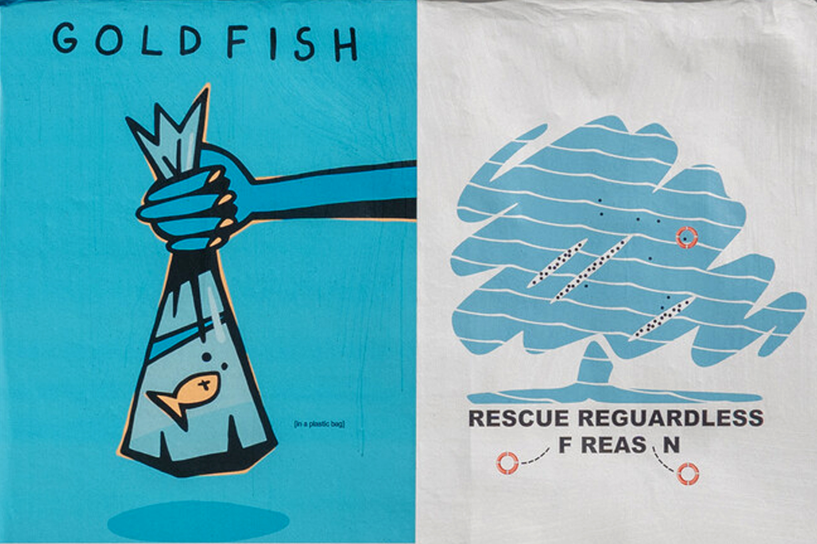
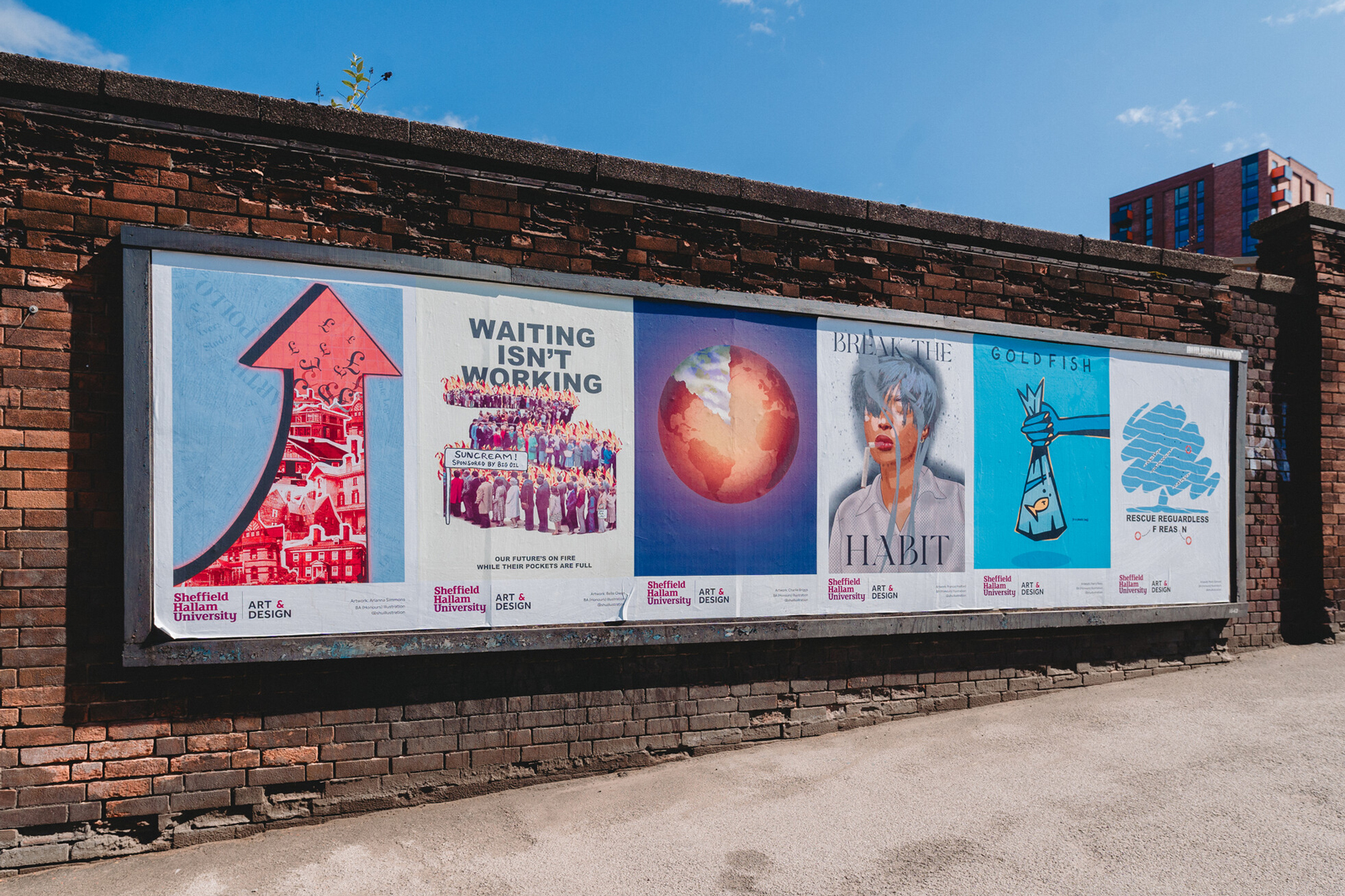
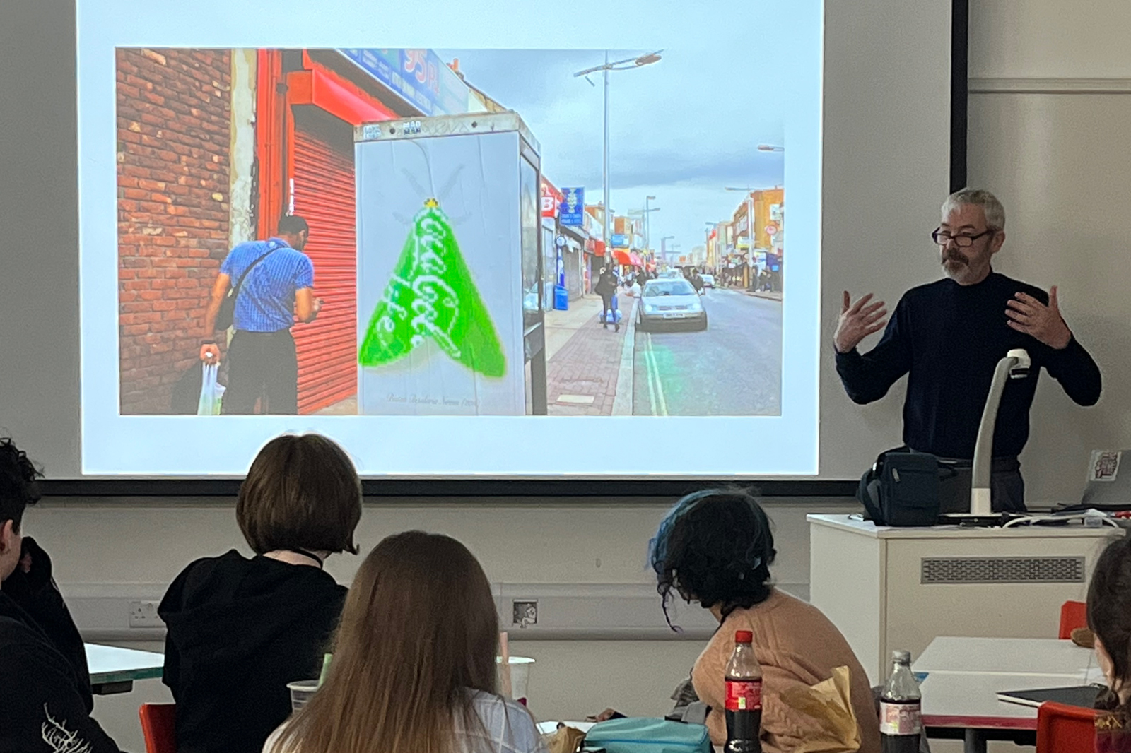
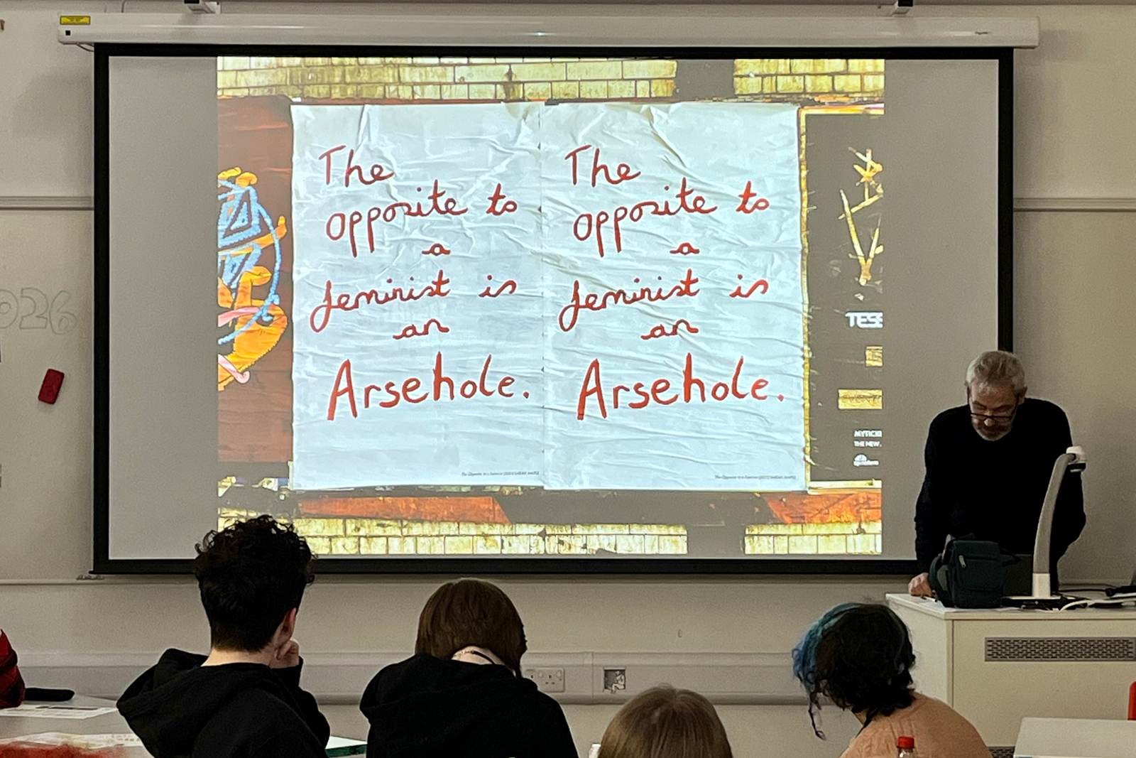
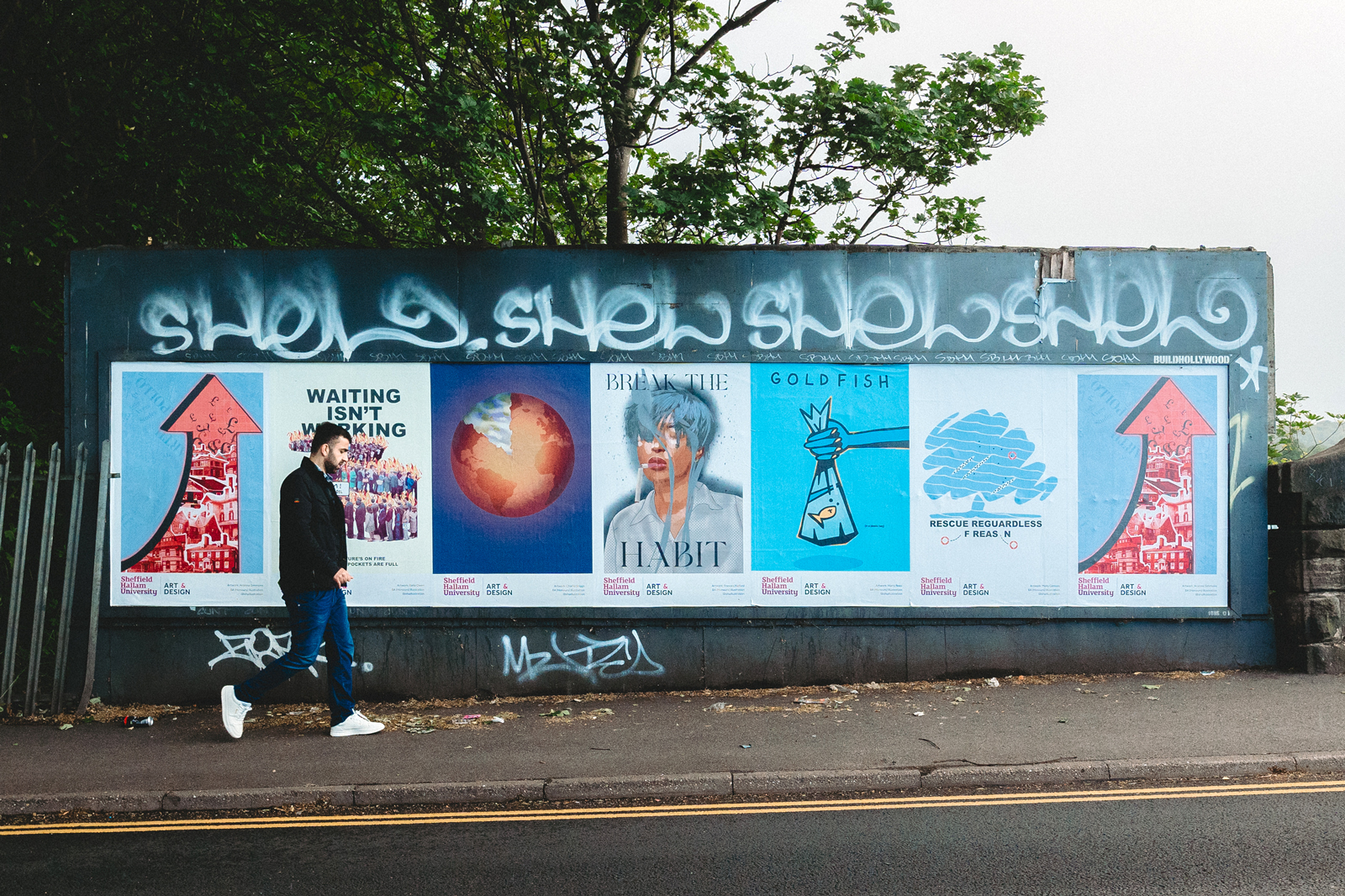
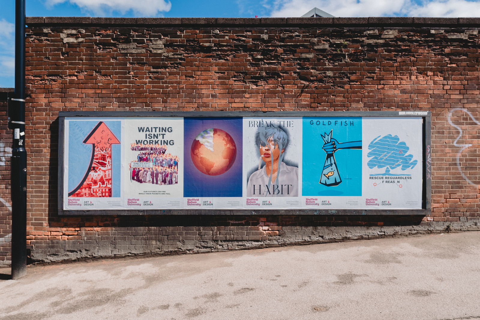
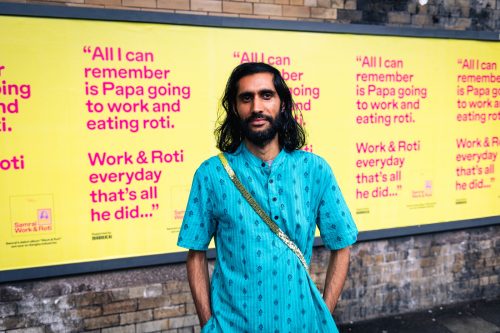
In amidst the commercial razzamatazz – the bespoke billboards, projections, point-of-sale displays, poster campaigns and assorted happenings – one of our favourite, most rewarding activities harks back to BUILDHOLLYWOOD’s roots in creative community and education initiatives. So, when the invitation came from Sheffield Hallam Uni.’s BA (Hons) Illustration Course to introduce a project exploring how to make impactful poster designs that garner attention on busy urban streets we jumped at the chance. Another key proviso was that students should make work about issues that are important to them, that directly affect their lives. 

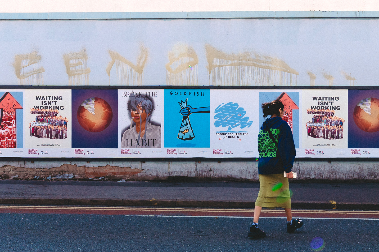
The illustrated introductory talk about ways to approach the design brief touched on all the obvious advantages of a poster campaign: in general, its potential for immediacy and relative ease of production. In terms of visual features that help a poster ‘pop’ there were, of course, considerations as to bold, surprising imagery and lettering; inventive and meaningful juxtapositions; mimicry and/or subversion of classic ad. campaigns or extant street signage; experimenting with scale; breaking expected design conventions – sometimes doing the opposite of ‘good’ design can produce a really great design. Also there were discussions regarding the attitude or spirit of a cut-through street poster. Thinking about what ‘tone’ is best to address passers-by, whether that be through shock, humour, inducements to feel compassion, empathy, concern… Participating students keenly addressed all the above and much more.

25.07.23

Words by Adrian Burnham

After six weeks of tutor supported plus independent R&D the time came when BUILDHOLLYWOOD helps choose several student designs that go into production proper and then appear on the streets of Sheffield. From an extremely strong cohort – with overall a great variety of designs and strong evidence of very thoughtful approaches to the project – six were selected as outstanding. 

Arianna Simmons’ brilliantly bold use of a brick red pointer containing collaged images of housing and introducing a flurry of pound signs at the apex of the rearing arrow is a striking visual expression of the cost of renting. The UK has the oldest housing stock in Europe. And compared to the European average the cost and paucity of rental accommodation in this country is dire. Even if the government were to reach its goal of building 300,000 homes a year it would take half a century to remedy the deficit.

Belle Owen made great use of the tactic whereby an existing image – in this case the (in)famous snaking queue of people coupled with the phrase ‘LABOUR ISN’T WORKING’ produced for the Conservative party in the late 1970s by Saatchi and Saatchi – is subverted and repurposed to convey a very different message. This approach works by presenting an image we think we know and then the realisation it’s different from the original helps both spark and hold attention. Owen’s adaptation of the phrase to say ‘WAITING ISN’T WORKING’ is obviously a fierce reproach to fossil fuel companies and an urgent call to action regarding the climate crisis. But there’s humour too. Her queue of people, already engulfed in flames, are all wearing sunglasses. The banner towards which the queue is headed reads ‘Suncream! Sponsored by Big Oil’.

Charlie Briggs produced two finely resolved poster designs. One cleverly appealed to our compassion with a slightly abstracted, wittily cartoonish, image of a whale paired with a dynamic and sinister hook. But it was his other design that would be destined for the streets. It’s great to see a strong visualisation that communicates its meaning without the use of text. Briggs’ ‘end of the world’ design – the globe as a disc of sun scorched earth and with the ‘ten-minutes-to-midnight’ slice removed – economically evokes both the nature of the catastrophe facing us but also the fact that time is fast running out.

Harry Rees created an eye-catching, radiant work in blue and orange. A single word ‘GOLDFISH’ boldly headlines the design and beneath that a fabulously pared down graphic of a goldfish in a transparent bag. In a funfair context this image suggests success, winning a prize! On the surface it’s a quite delighting, fun drawing. But the introduction of a small, bracketed text that reads ‘in a plastic bag’ next to the fish immediately upends any playful connotations. We’re left with the stark and bitter realisation that humanity – mired in its own plastic waste – isn’t in any better situation than the forlorn creature in the bag.

Molly Gilmore’s poster manages to combine complex (and, to be frank, disturbing) info. in an eye-catching design resembling the blow or spout of moist air whales emit on surfacing to breathe. Details in the bold creative – white lozenge shapes crammed with black dots recall the children’s game ‘battleships’ – allude to the tragedy of migration and lives needlessly lost. More black dots sit outside the diagrams of crowded vessels. One of these small dots is circled with a life belt. A clever typographic manoeuvre at the base of the poster reiterates the graphic message. Gilmore has deployed the phrase ‘RESCUE REGARDLESS OF REASON’, only the ‘O’s in ‘OF’ and ‘REASON’ have come adrift and been substituted by more lifebelts.

Finally, Frances Halford’s figurative portrait of a woman – who, at a glance, resembles Rihanna which is always going to pique interest! – with her eyes closed and broken cigarette dangling from her lips is a strong image. Her face is swathed in smoke, her blouse a rash of grey Ben-Day like dots and her silhouette is fringed with a charcoal tone, smudged and splattered, like the residue in a used ash tray. Halford’s pithy text aligns with the woman’s world-weary expression and the snapped cigarette, it says simply ‘BREAK THE HABIT’.  

It was a privilege to give feedback to the whole group. While it’s regrettable that only six of the final Sheffield Hallam students’ designs would make it onto the city streets the range of artwork is a testament to students’ individual efforts and skills. What’s also of note and to be celebrated – obviously in large part down to the tutor and head of course – is that there’s no one ‘house’ or ‘college’ style. That energy, inventiveness, and commitment to convey important themes and messages via the medium of street posters is great to see in this upcoming generation of communicators.

Previous article

Your Space Or Mine

Samrai drops debut album Work & Roti inspired by his heritage

Next article

Partnerships

Affecting industry change, Saffron makes the case for equality in music